


Love Good Color
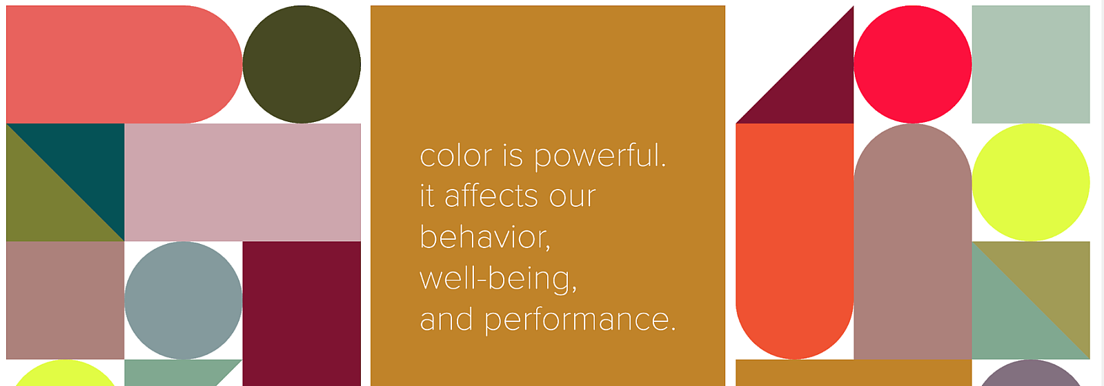
The concept of Love Good Color, founded by Laura Guido Clark, is simple: color has the power to affect our emotions, behavior and performance.
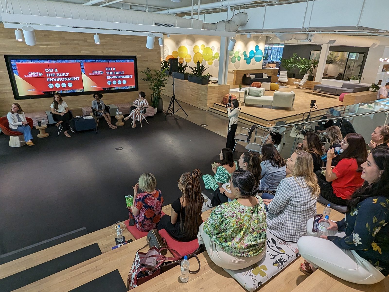
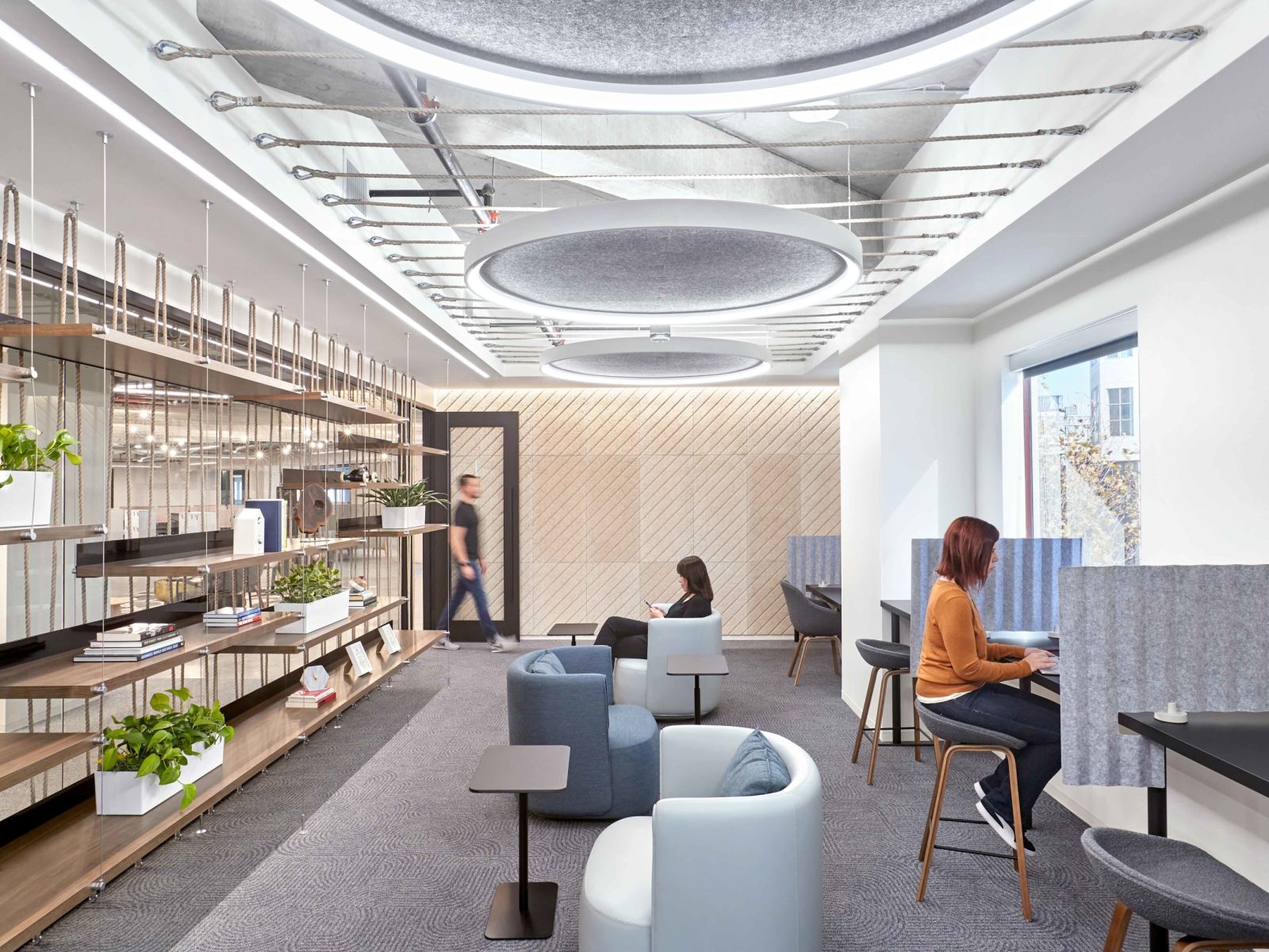
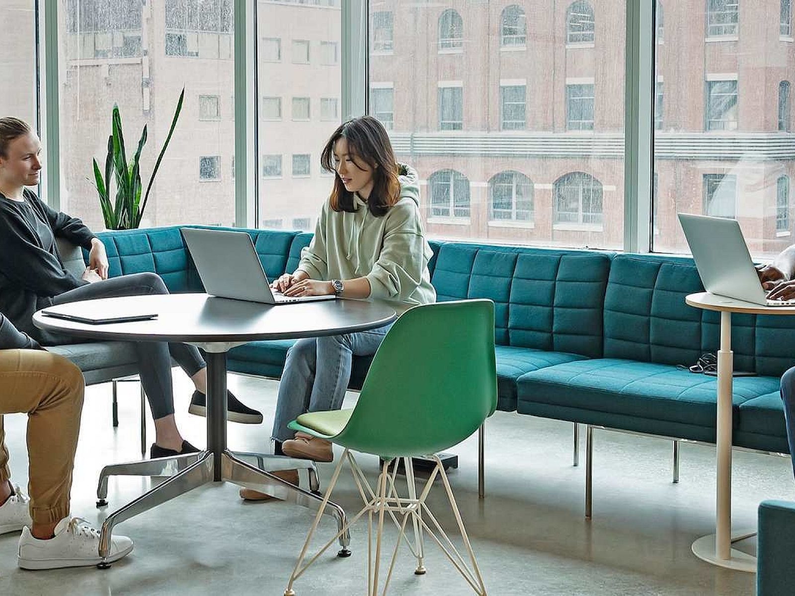
Love Good Color is a patented system launched by Laura in 2017 that integrates science and the senses, enabling designers to factor in emotive response when using color – and thus effectively choosing the right colors for a space. For example, the Adobe Founder’s Towers use color to enhance the uses of their working space, social space and collaboration zones. Pivot’s new Los Angeles Design Center uses color to create hyper and hypo-sensitive areas for focus, respite, or creativity, depending on the need of the user.

The human aspect of color.
“Our mission is to empower people and companies to live well with color. We seek to emotively transport people and helps them understand color’s power to forge connections to products, physical spaces, and the world around them. Our system takes into consideration the brand as well as the emotional response you want people to have with a product or a space,” said Laura Guido Clark, Founder and Chief Executive Officer.
“In the LA space, we programmed and assigning specific palettes to each area to reinforce the humanistic impact that we wanted to have users feel in that space. Then color, material and finish selection was made,” said Laura.
As a former textile designer with a degree in interior design, Laura has been passionate about color. Today, Laura serves as a color educator and strategist who speaks internationally on the humanity of color and its impact. In 2011, Laura founded Project Color Corps™, a nonprofit organization dedicated to painting historically under-funded neighborhoods with color and pattern that impart positive messages of optimism and hope. As a result of her 20 years of expertise, Laura was an expert design blogger for Fast Company. and was also honored as the IIDA Northern California Chapter recipient of the 2014 Leadership Award of Excellence.
“As designers, we need to provide a rationale for choices in a space more so than just a preference. This system backs up trend and intuition with science, but addresses the humanity of a space at the same time. I started Love Good Color to provide the language, or in essence a roadmap, needed to make this process necessary,” Laura said.
Love Good Color encapsulates the important process of color selection in design, taking into consideration the people who live and work in the space. At the heart of the system is an understanding of what emotions and functions need support - and then color is assigned accordingly. The system also addresses the overall organization or company ethos, and how color supports this identity. In the examples of Pivot’s Los Angeles space and the Adobe Founders Tower, color was used to reflect the company culture and also spark creativity in areas such as design workspaces or collaborative zones. Laura often prescribes unexpected color combinations to raise interest, prevent boredom and enhance focus – think color pairing that makes a heads-down space feel productive while also feeling fresh and alive.
Love Good Color has been used by various Pivot partners including Gensler, Interior Architects, Atlassian, and Studio O+A, as well as MillerKnoll to create products that resonate with consumers and succeed in competitive markets. Learn more about Laura’s design work at Laura Guido-Clark Design.
